

With seemingly endless dining choices, experiences and luxury accommodations, how can we showcase everything yet make it intuitive and engaging?
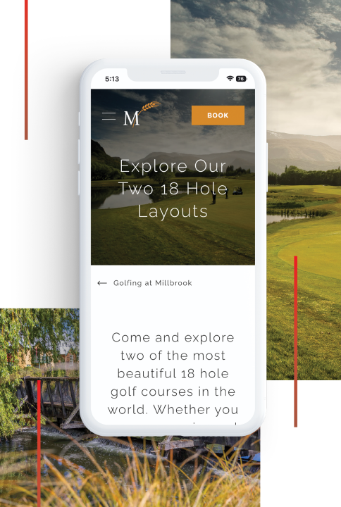
Collaborating with the marketing team, we first created customer personas for the different types of guests that frequent the resort. By putting ourselves in their shoes, we could contextualise their digital behaviour and come up with the best way to present information in an intuitive and digestible way. For Millbrook, showcasing the resort’s beauty was a priority; therefore, we ensured bold full-screen images were used and limited the amount of written content by using subtle devices to assist with content navigation.

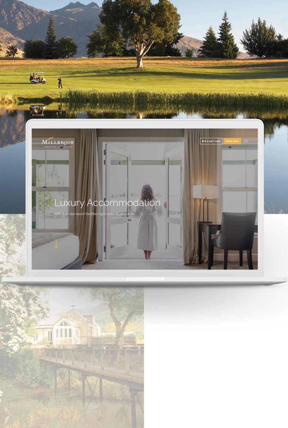
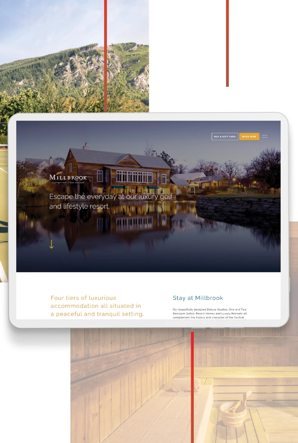
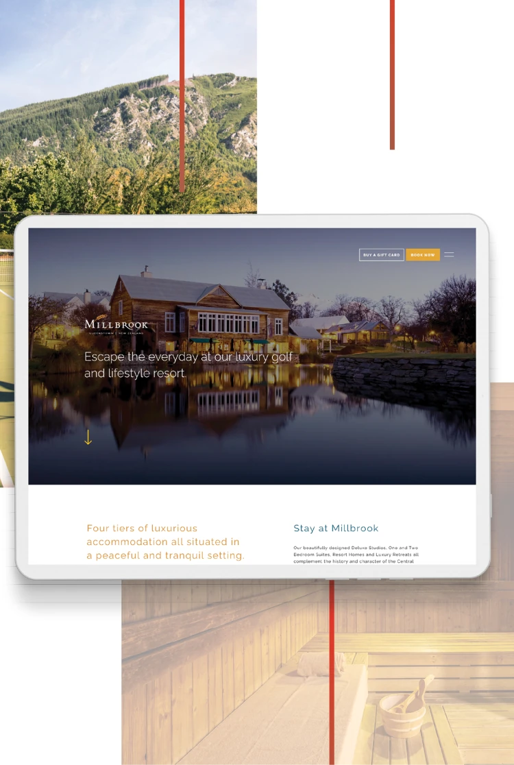
The new website was an opportunity to add modern functionality and integrations that make it easier for customers to engage with the resort. Everything Millbrook has to offer, from digital gift cards and experience packages, to restaurant and hotel bookings, are only a few clicks away.
The content management system was designed and built in an easy-to-use modular format, allowing the marketing team to add new content without the help of a developer.
Everything we built was with optimisation and performance-centricity in mind. SEO, analytics tools and tags were added to improve the organic ranking and to see how users engage with the site and where drop-off in conversions happen. Through Conversion Rate Optimisation (CRO), our team optimised their digital advertising by measuring its effectiveness across campaign touchpoints, fine-tuning each stage of the sales funnel and making tweaks that enhanced the landing page performance.
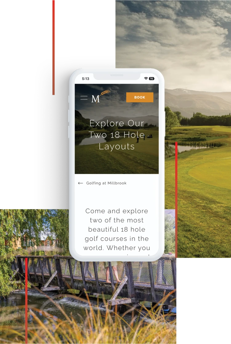
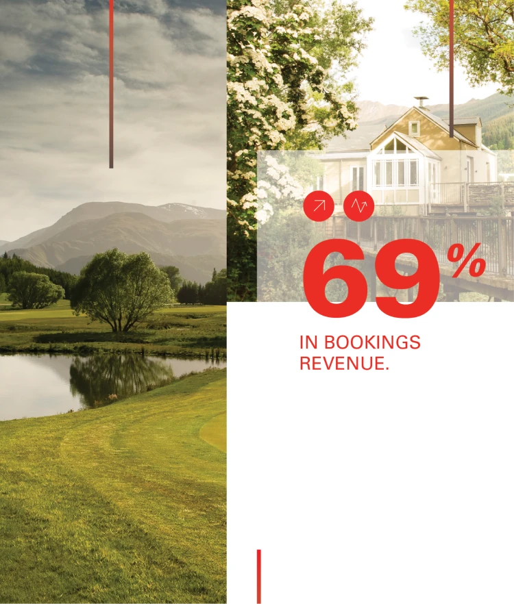
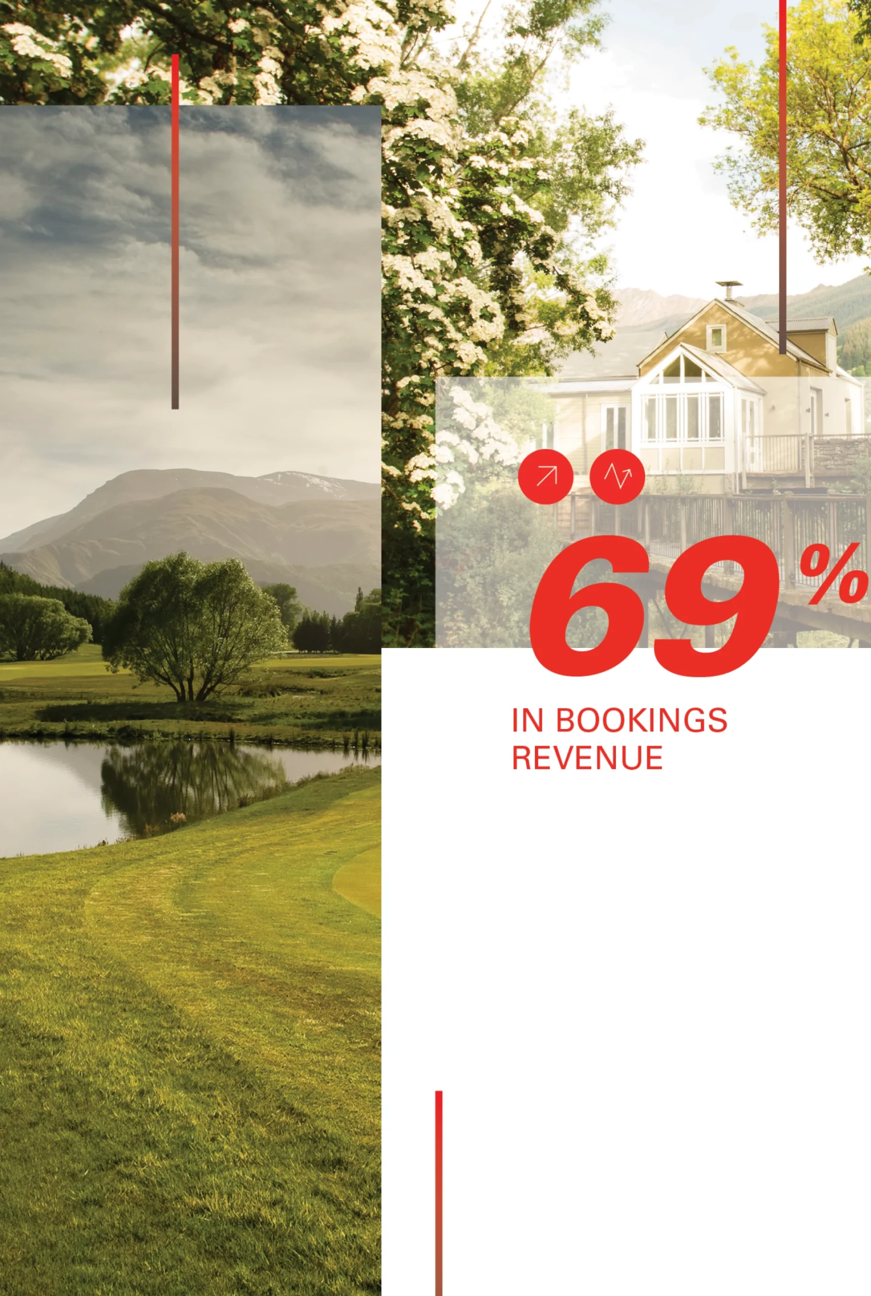
Since the website relaunch, we’ve continued to work closely with Millbrook’s team for ongoing website innovation and performance campaigns. Our design and development team rolled out new features like digital in-room dining menus, increasing efficiency during challenging times of a tight labour market, while making every stay an indulgent and luxurious experience for Millbrook’s guests.