The Neurological Foundation
New web platform
Best Award shortlisted

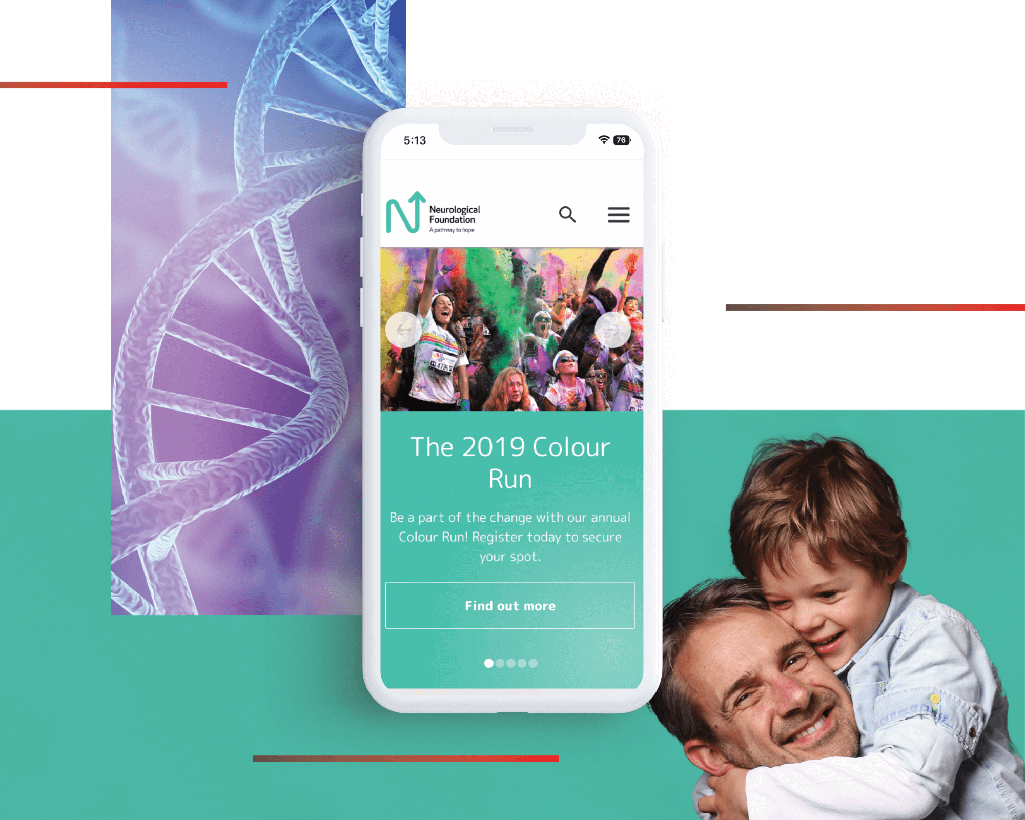
The Neurological Foundation has a dedicated supporter base that donates regularly and is engaged in the charity's work and cause. However, for the foundation to continue its growth ambitions, it needed to attract an audience beyond its core supporters and make it easier for casual donors to give. Another challenge that needed to be resolved was the misconception that neurological diseases exclusively impact the elderly. With a wide range of education materials and engagement events, the new website needed to showcase this logically and easily.
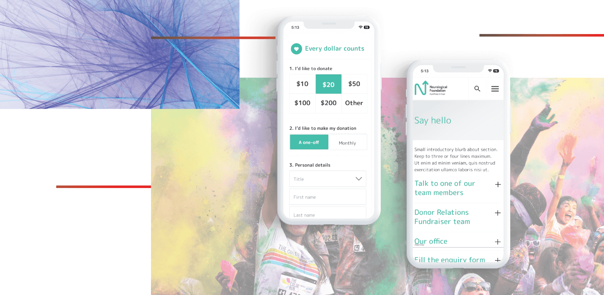
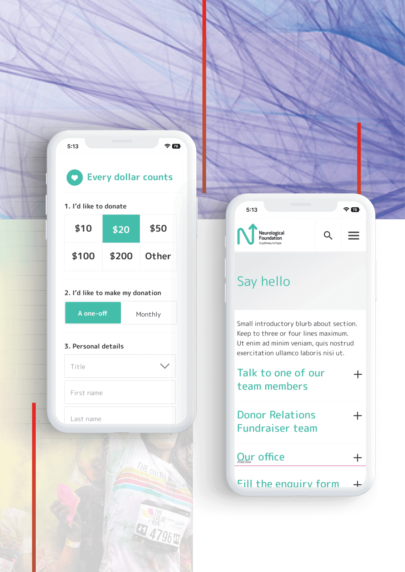
To make the website easily accessible to the Neurological Foundation's core demographic, plus its ambition to reach a more diverse audience, we put ease of navigation with modern touches at the core of our UI and UX design.
Features like a large menu bar and buttons secondary menu on level two pages that show the key topics of level three and below help site users to clearly read and navigate the site.
We've added UI twists that reflect the foundation's fresh new brand, such as curved edges on events and content blocks and a randomised banner that features a 'brain teaser' of neurological trivia. In addition, the redesigned events page allowed users to look at key events by month and improved the visuals to entice engagement and registration.
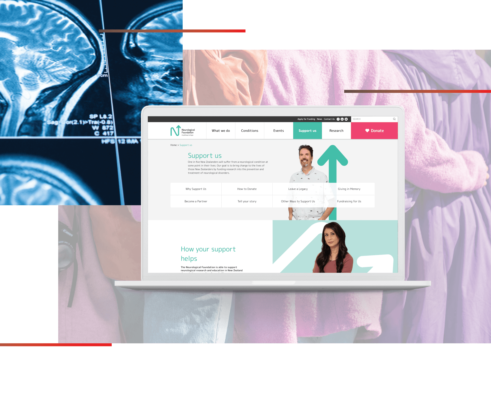
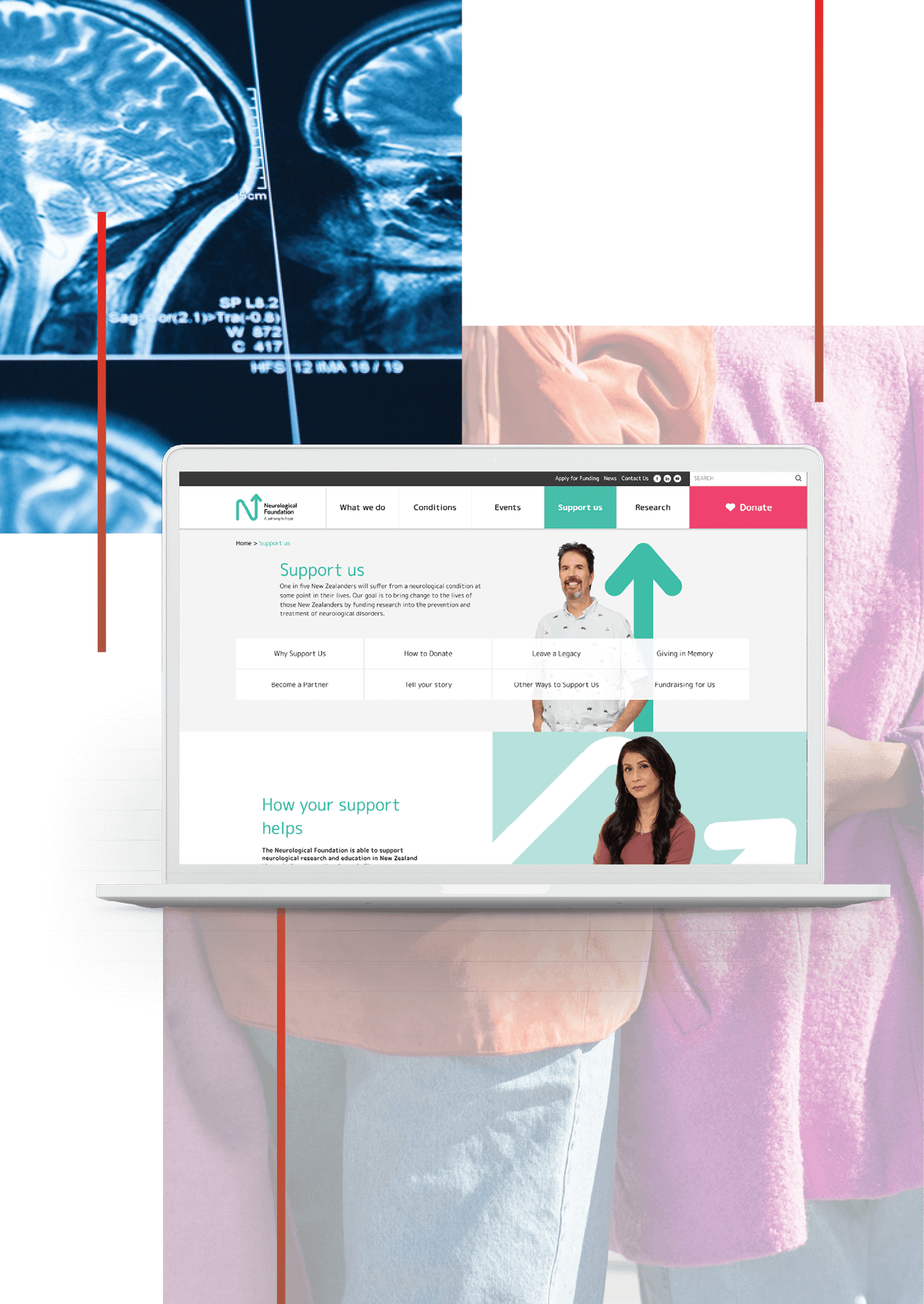
With the priority of enabling the team at the foundation to create and modify various types of pages, each with a specific layout style, our development team created a flexible and guided CMS. We started with templates that provide structure followed by modules that allow easy customisations. From marketing to events, we kept the range of web admins in mind and added brand guidelines within the CMS to help their staff keep the style consistent.
With 45.8% of all web traffic in New Zealand on mobile phones (Statista, 2021), we added screen responsive features that make visiting the website on the go a breeze. From a sticky navigation menu that minimises as the user scrolls down but reappears in full when scrolling back up to secondary menus that automatically turn into drop-down buttons, the website's content is kept front and centre.
