MB Investments
UI Design
Web development

The investment and wealth management sector is competitive and dominated by large renowned players. MB Investments needed to not only stand out from the crowd but also attract high-value discerning customers. The Founder and CEO Marcus Morrison were clear in his vision of providing a white-glove service for conservative investors. The challenge was to communicate this visually in a succinct way that balances style and substance.

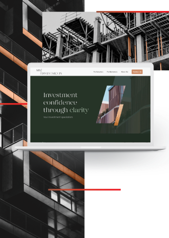
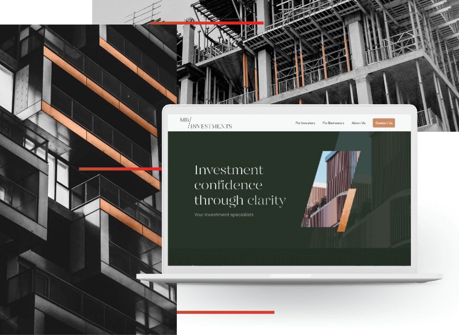
Our design team began the process by position mapping MB Investments within their sector followed by creating several concepts for the client. Working collaboratively with their team, our designers developed digital brand visuals that are a suitable embodiment of the business and its people - understated, sophisticated, and professional. A core-orientating idea was to use the MB Investments’ logo plus the shapes and geometries of construction as user interface design tools.
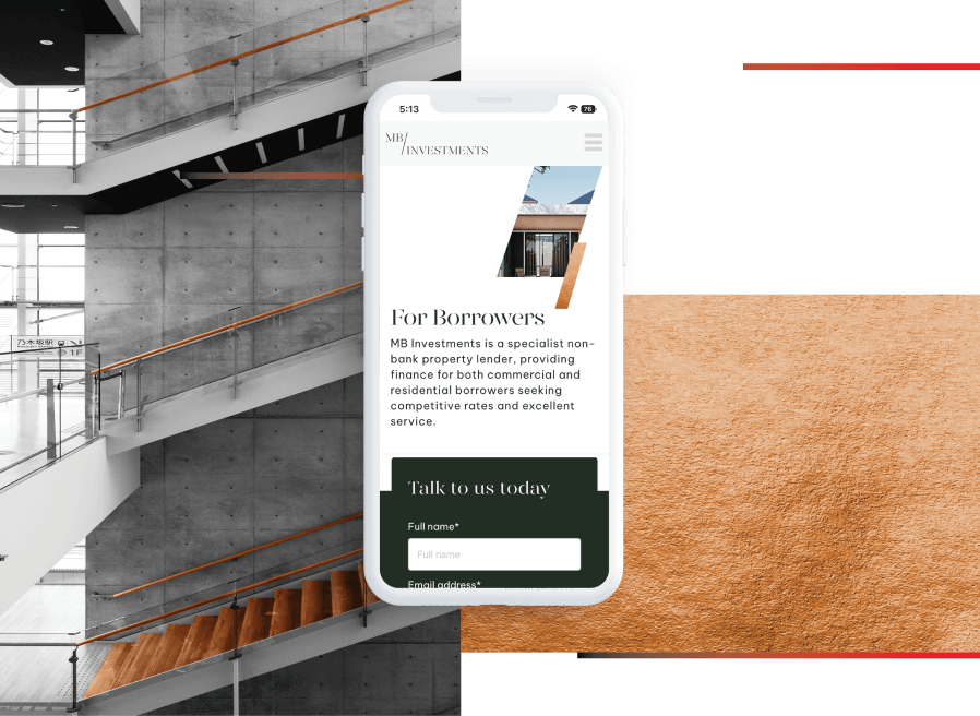
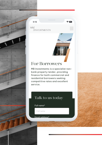
To bring to life the MB Investments brand our team focused on several priorities; elevated aesthetics, articulate messaging, and geometries that reflect high-end constructions. A core feature was the ‘slash window’ developed from the company’s logo. As a cropping device, it either rotates showing different building styles or is parallax animated to add flair without distracting from the written content. We introduced copper colours and textures to give the web visuals richness and depth, whilst a slick and elegant font choice communicates the distinctive brand personality. For iconography, we took inspiration from structural engineering and created a set of geometrical abstract assets that can be flexibly used by the client depending on the context.
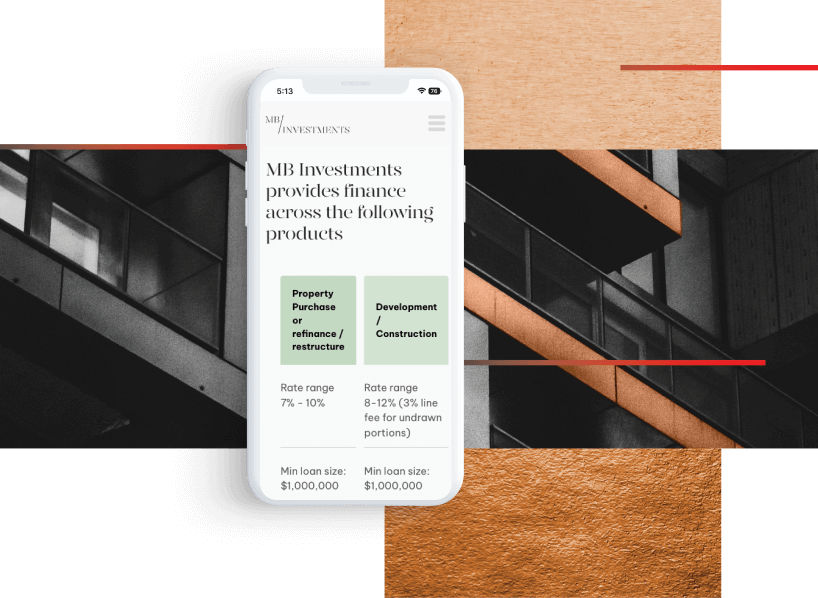
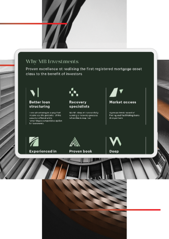
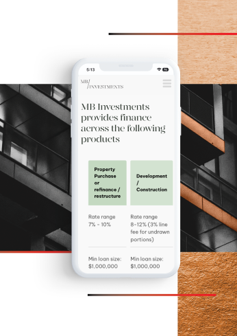
Whilst this was a straightforward small-scale website, we took care to optimise it for mobile. Understanding the need for clients to get succinct and straight-to-the-point information when browsing on the go, animations were kept to a minimum and written content was reduced.
We also placed forms above the fold on key pages to encourage lead generation, and comparison charts were created in horizontal scroll to help with readability.
