The Helen Clark Foundation
Website redesign
Online payment capability
Content management system

With an engaged audience and active research projects, the foundation needed to overhaul and reconstruct its website. The new website had two priorities at the very core of what they do - education and engagement.
Education - with a plethora of content, the foundation needed a way to showcase active projects and completed research, publications and media releases in a logical, accessible, and visually cohesive yet engaging way.
Engagement - the foundation hosts regular panel discussions and events to encourage debate and the sharing of ideas, opinions, and insights. As a non-profit organisation, the Helen Clark foundation is funded by the generosity of its members and philanthropy; therefore ways to encourage membership growth and giving were a priority.
The foundation had a firm idea for the sitemap and wireframing of their new website. We brought our expertise in user-interface design and development capabilities to the table and worked collaboratively with their team.
Our ideas were centred around ease of access for a highly engaged yet diverse audience. We spent time thinking about and working through how we could promote the media and publications to ensure the process would be user-friendly, improving topic discoverability and downloads. The membership and donations feature also needed to be clear and articulate but not overshadow the educational purposes of the foundation.
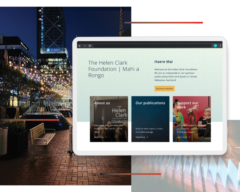
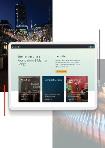
We took a balanced approach to the UI design and were mindful of not overwhelming the user with actions and prompts. We created active research sections that show big topics of the foundation and established a tagging system for content discovery and management of published work.
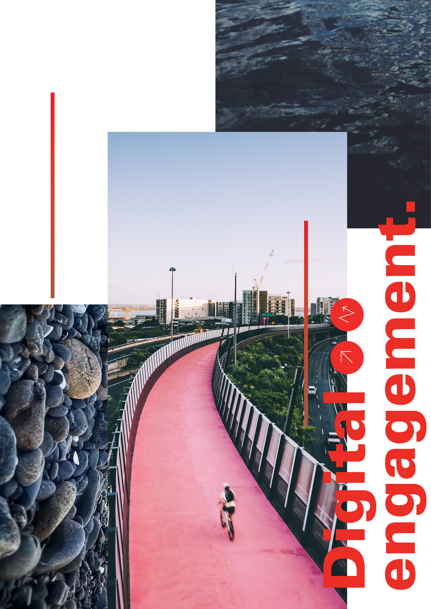
Through iconography and colours, we could clearly show site visitors’ public and members-only events and act as a nudge for becoming a member. On the giving page, we created tabs for users to easily toggle between one-off donations and becoming a member. We articulated the benefits of each and showed how the donations help to further the foundation’s work.
Throughout the website, we added accent colours and selected imageries that complimented the brand guidelines of the foundation.
Incorporating community features was also vital to this website being a success. As a charity, the Helen Clark Foundation thrives on community engagement and involvement, so we needed to create straightforward paths for people to sign up to become members or donate. This tied into the importance of users being able to access documents and reports quickly, as being educated on the causes was crucial to the signup process.
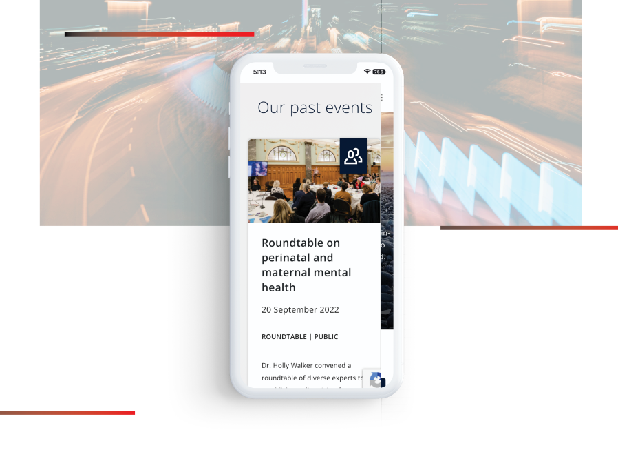
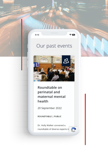
This was a straightforward project for our development team, taking our client’s and designers’ visions and turning them into a digital touchpoint that makes a difference. A focus for our developers was the payment page, ensuring not only ease of use but also a seamless and frictionless experience for new members.
