HAZARDCO
+280% new leads
+207% new customers
-58.5% cost-per-lead
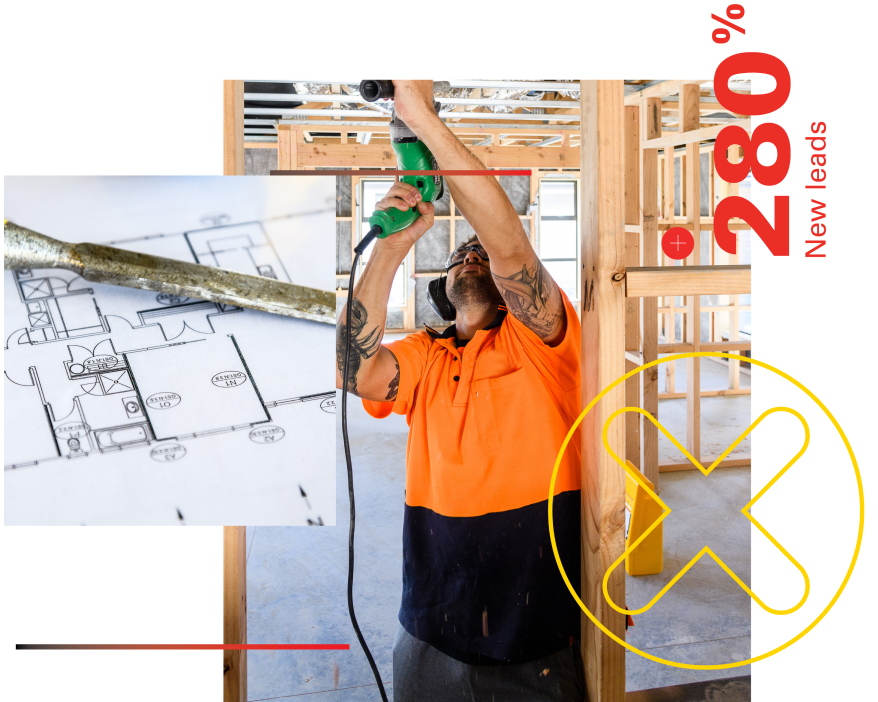
The residential construction sector comprises both large organisations and small businesses. The work is physically demanding, project managers are time-poor, and staff can be at varying levels of their careers. It became clear that to increase buy-in and promote good health and safety behaviour, HazardCo’s solution needed to be intuitive yet engaging, frictionless and integrated at every stage of the digital touchpoint. Furthermore, the platform was to be designed in a way that helps generate insights and analytics of the site visitors and user base.
By defining the various customer personas and deep diving into their pain points, BBT redesigned and structured HazardCo’s website to better engage and articulate its product offerings. Robust customer journey maps were developed based on targeted personas’ needs and path-to-purchase. We focussed on a human-centric site design, articulating the value propositions of HazardCo’s offering in an approachable and easily understandable way.
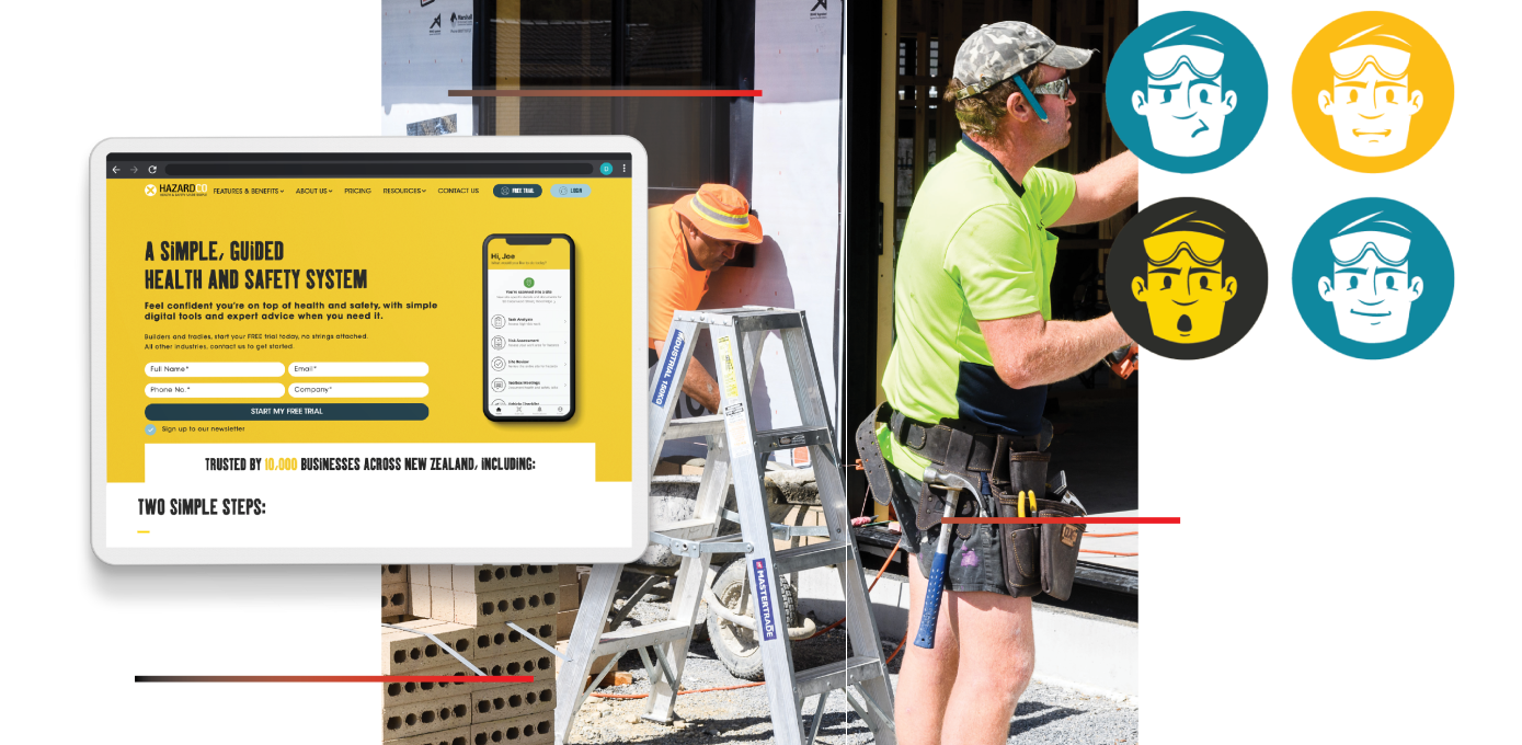
Customers engage with the HazardCo product in many ways, depending on their workplace needs, age and job role. To ensure a seamless user experience, we innovated and iterated the journey across the website, members' web portal, apps, advisory speed-dial services and email marketing. We created a system that fully integrates CRM, SaaS, finance, and marketing automation, allowing the customers to engage with HazardCo frictionlessly through the channels they prefer.
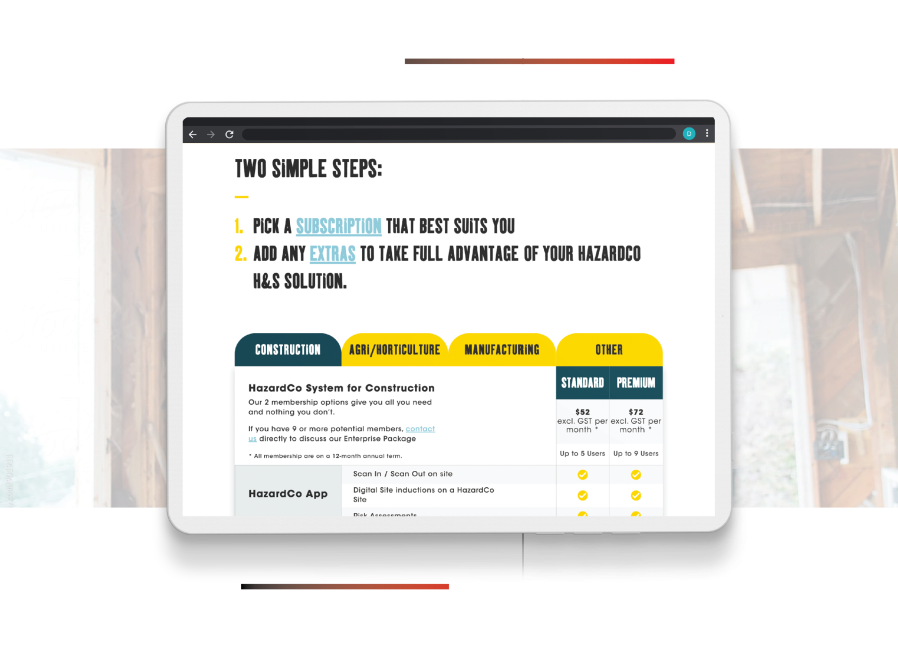
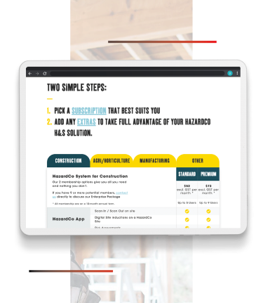
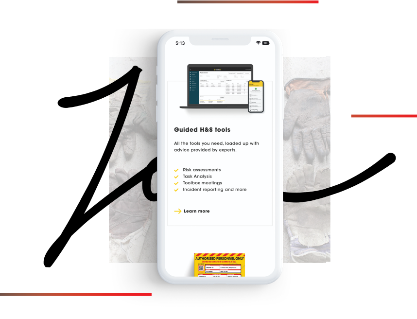
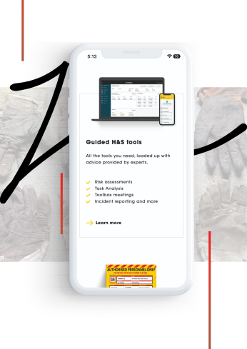
To better understand the diverse range of users, we collaborated with HazardCo's sales and customer support team to understand typical drop-off points and then added advanced analytics that enabled us to pinpoint the barriers to lead generation. Iterative A/B testing on methods of interaction and product offerings refined and improved the level of site engagement. We adapted written content to digestible video alternatives for time-poor tradie audiences, which increased time spent and nurtured users through our lead generation funnel. We then adjusted the UX/UI to lower the friction and increase conversion.