Feimso
UI Design
eCommerce
Feimso faced a significant challenge in finding a partner who could come in and own the tech. Without the budget to “do it all” this project required balancing user needs, capital expenditure, and essential features for the MVP. It was crucial to ensure that the platform was built on a strong foundation that could support its future growth. Strategically prioritising what was needed to create a scalable, high-impact platform from the get go.
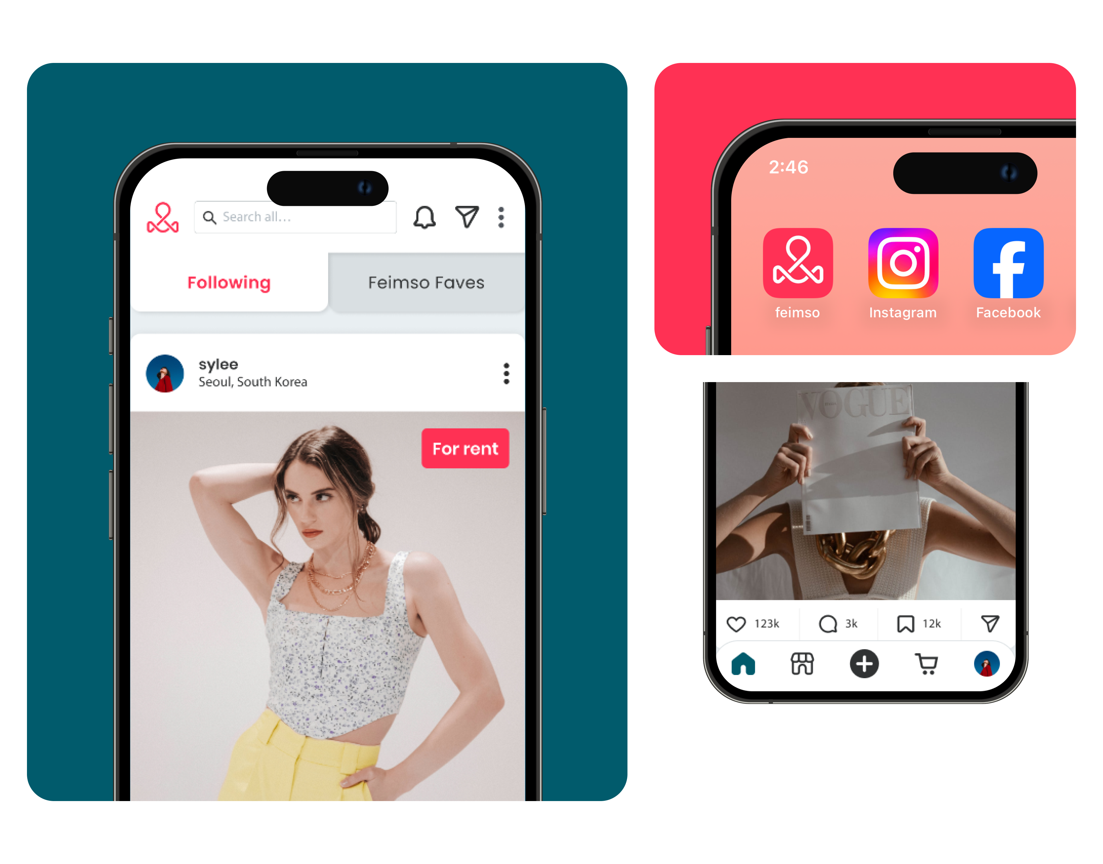
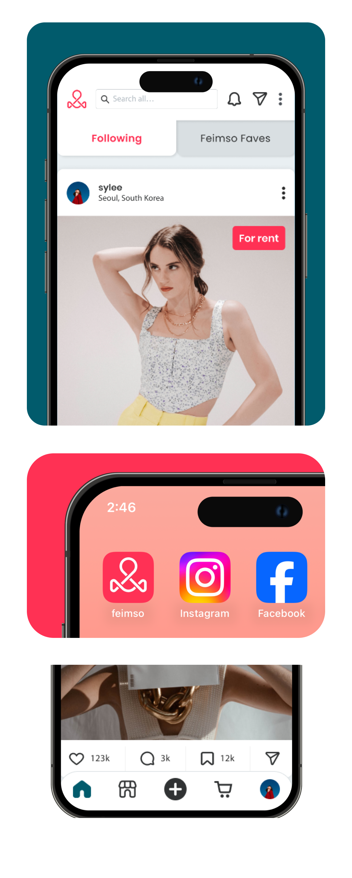
Our goal for Feimso was to prove a product in the market that had both their vision and the capacity to raise capital for their future growth. This meant we needed to create a fully functional fashion focused social and ecommerce platform, that users could interact with, making it something tangible and not just an idea. This demanded innovative thinking and new approaches to seamlessly integrate the platform's needs.
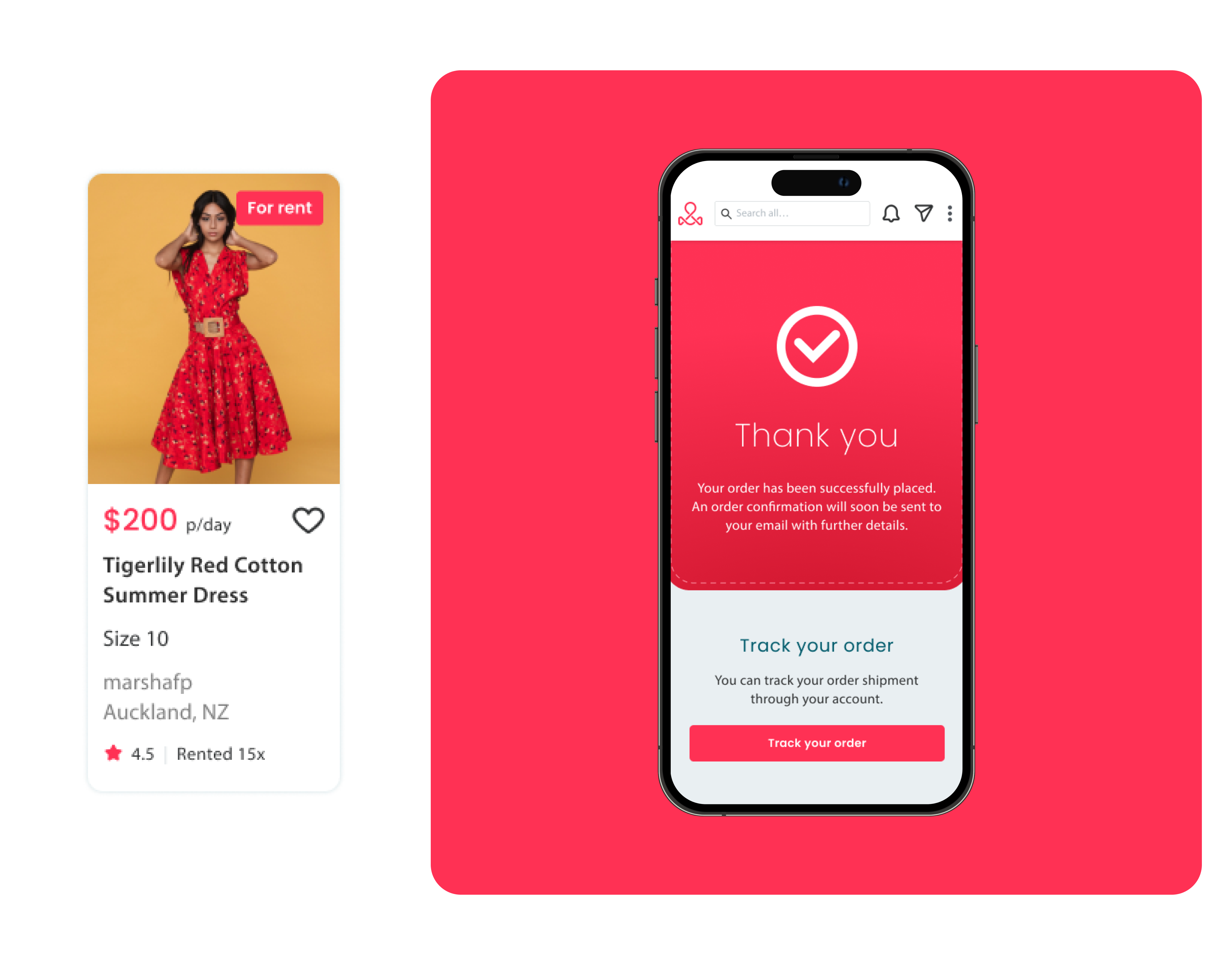
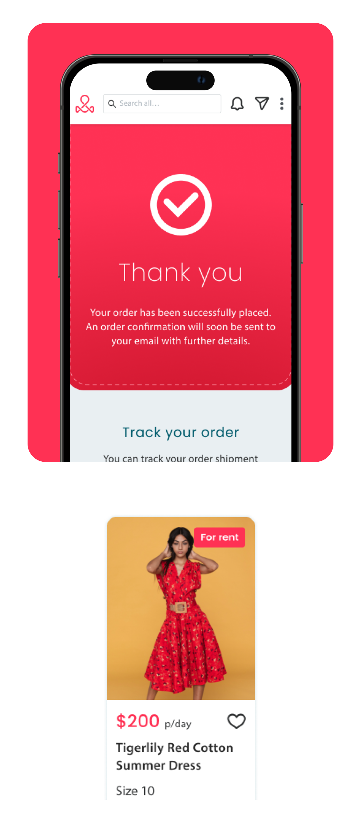

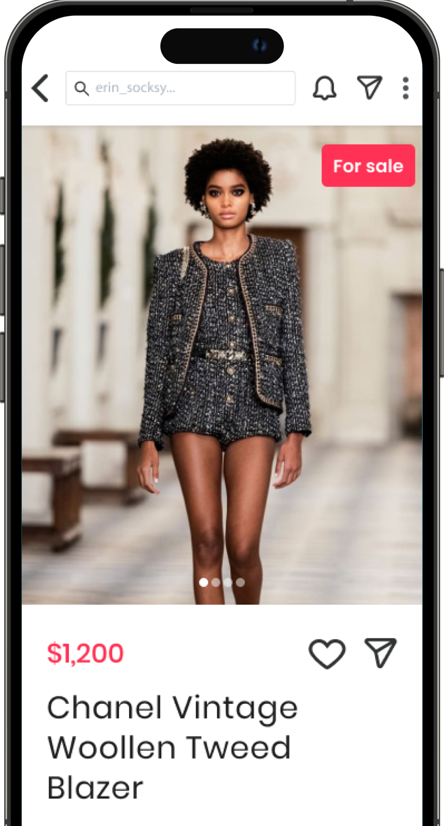
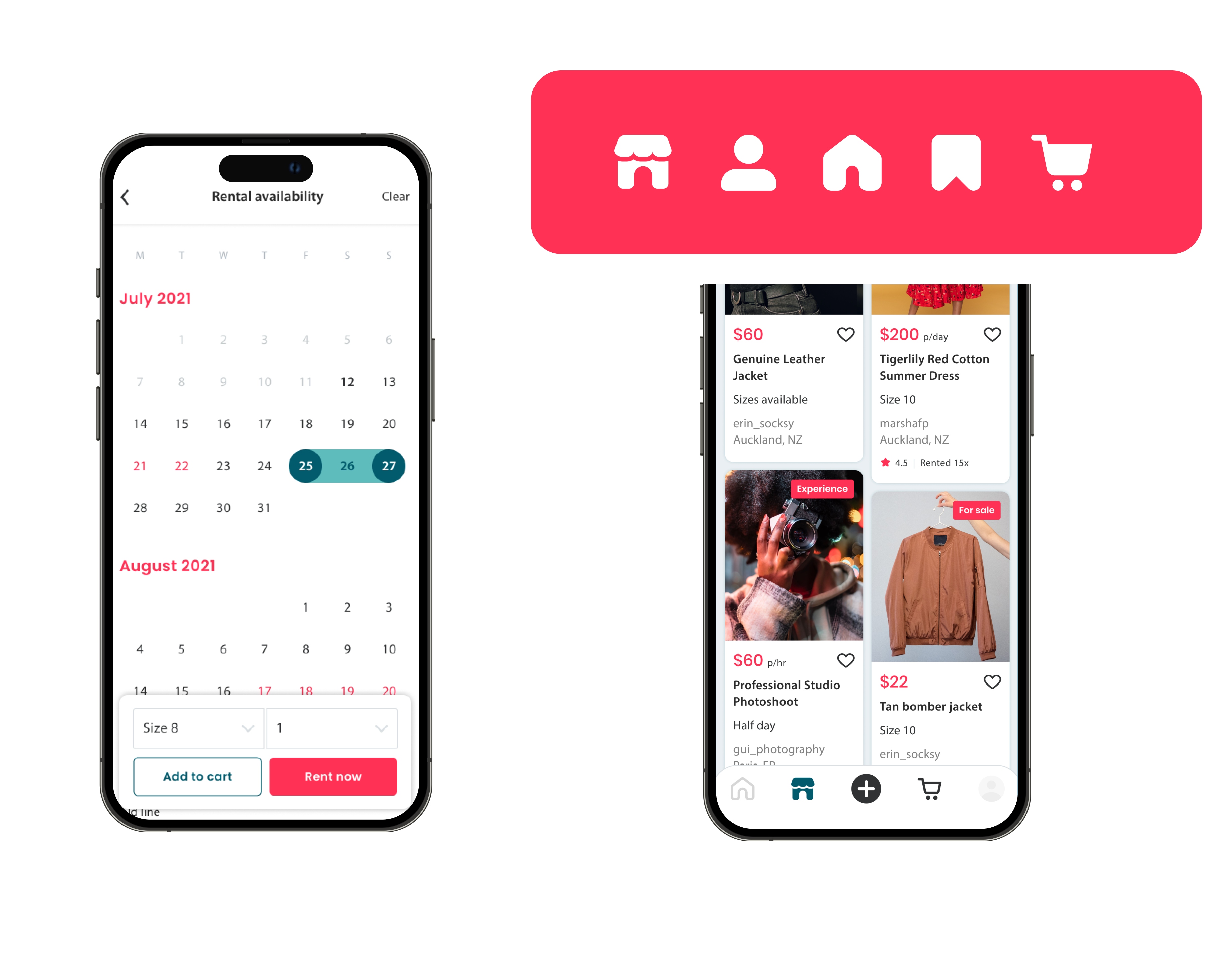
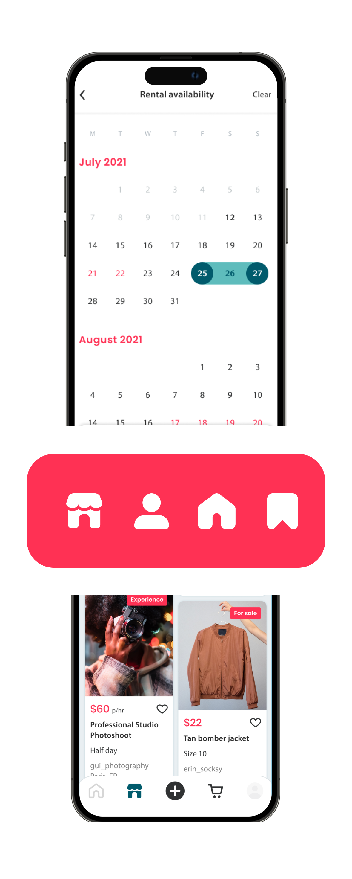
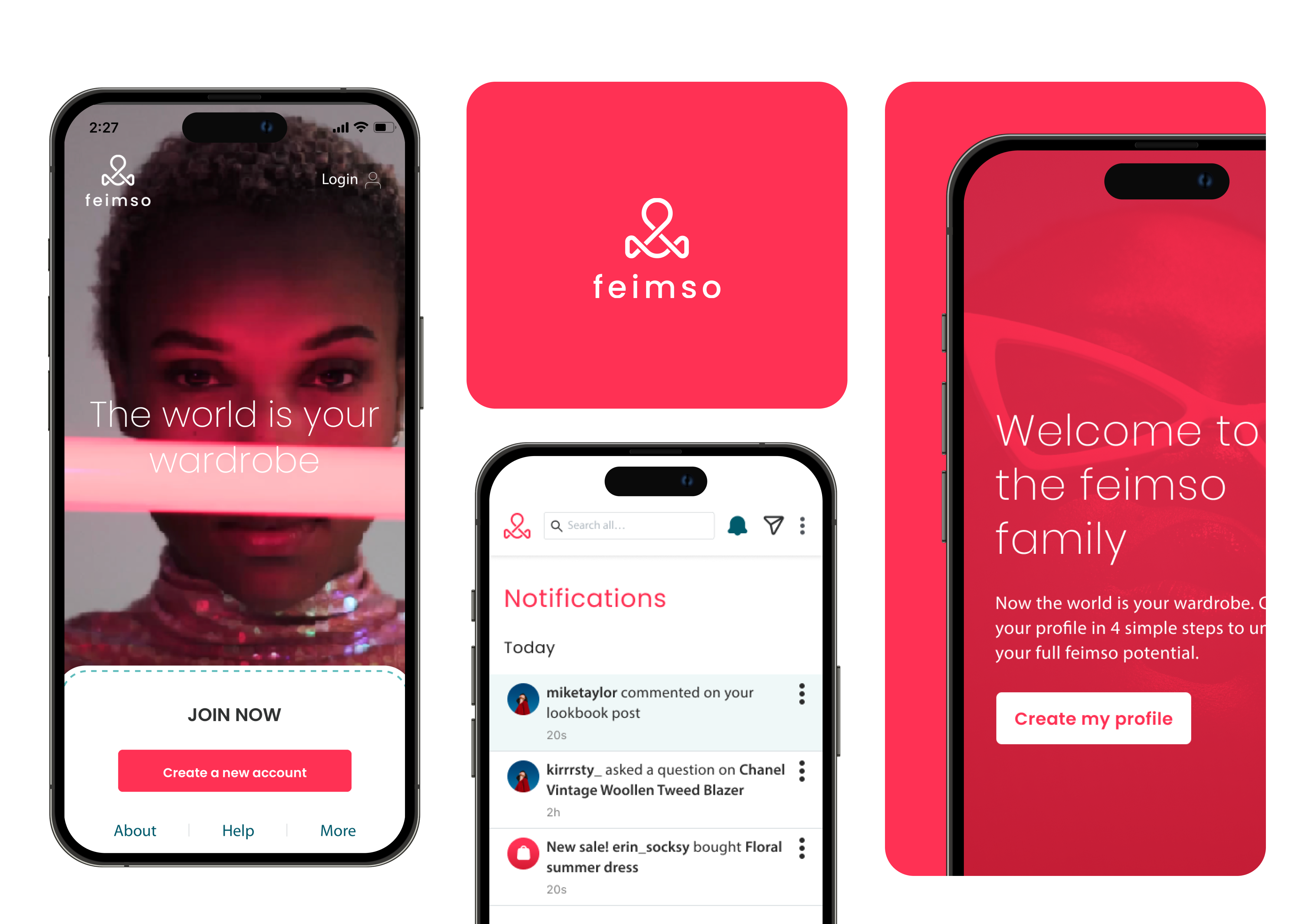
For the Feimso app, we took a user-centric design approach, prioritising simplicity and clarity. By focusing on people and fashion, the interface is simple but inviting, with a clean aesthetic that guides users through the various functionalities. As users interact with the platform, we're able to take the data as insights to inform iterative design enhancements, ensuring an intuitive and seamless experience that will evolve to meet the needs and behaviours of users.
